*sigh* I need help. Honestly.
I finished my evil paper around 5, and decided take the rest of the day off 😛 I worked on Damaged, played around with These Small Hours, but then…I got bored. And when I get bored, I think of things I could do that aren’t useful.
So I made covers for the next two ebooks I’ll be compiling. And then I didn’t want to wait for you guys to see them, because hey, what if they suck? And I’ll have you know…that since my computer crash, I lost all of my Alicia Leigh Willis material, so now when I go looking for Courtney screencaps, I am ASSAULTED by Jason/Courtney pictures.
Is there no decency in this world?
Anyway. I’m halfway done Episode 003 of Damaged, it’ll probably be ready this weekend or Monday. I’ll post the next chapter of Few Words tomorrow morning, and then announce the contest winners a little after 7 PM EST on Saturday. I’m going to try to do two winners, if the plugin will let me.
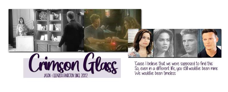
Here are your advance covers. Click on them to see them full size. (Also, let’s be distubed that I can find blood spatter texture for graphics. This world…worries me.)


Comments
Okay, you asked for honesty. The Witness cover is really cool, except that the pix of various characters seems to detract from the drama of the “splatter” effect. Could one or two photos be used? As for the “I Shall Believe” cover; I’m sorry, but nothing can make Corho look good. Otherwise, I like it. Forgive my ignorance in these matters. You have done so beautifully on everything.
covers are cool
Covers work for me. The blood spatters are gross, but in a cool way. It definitely goes with the story.
Yay for ebook covers. I really like the I Shall Believe one but I feel like the cover for The Witness is too busy. I would like it better if the character pictures weren’t faded into the background. Perhaps make them black/white or monochrome to match the color scheme of the splatter?